Friday, September 3, 2010

BLOG week 6- Barbara Kruger


“Sex/Lure” (1979)…the poster displays Kruger’s perfected ‘agitprop’ style. It is composed of a cropped black and white pop-art photograph of a mans mouth, chin and neck in the background, with a prominent red border framing the image. A brown cross and horizontal line overlay creates an interesting composition, dissecting the different parts of the face. The words “SEX” and “LURE” are positioned strategically underneath and amidst these lines to create a visual commentary. It’s hard to explain how the composition works to create this commentary; a relationship is created between the two words so that I just have this really clear reading about what the artist is saying just from looking at the image. It has a strong mood; I particularly liked this poster because it is a bit more mysterious and complex than some of the others in a way that I cannot explain in words how it makes me understand it. This work is very 2-D and ‘flat’ in comparison to her more modern installation works, but this flatness works because the statement is very blunt.


“Between Being Born and Dying” (2007)…was an installation at the 2007 Women Artists’ Biennale in Seoul, South Korea. The work was commissioned by the Lever House Art Collection. Her work is consistently about the kindnesses and brutalities of social life: about how we are to one another and this installation is no exception


-'I think what I'm trying to do is create moments of recognition to try to detonate some kind of feeling or understanding of lived experience. I try to deal with the complexities of power and social life, but as far as the visual presentation goes I purposely avoid a high degree of difficulty'.
barbara kruger


The work is a mixture of ironic statements, pithy humor, and political commentaries which create an overwhelmingly bold environment. The black and white colors of the huge texts are ironically true to the statements themselves, which are very black and white i.e. they are true or false. They are not relative. The work is different to her poster style work because of the 3 dimensional aspects. I imagine as you move through the space the bold black and white statements interact with each other and change as you move through the space.


Kruger uses the contrast and a consistently simple colour palette in her work to create a strong impact. The font she uses (futura) is clean and crisp. Her work is no-nonsense and steers clear of being decorative or traditionally attractive. The impact is created also by the style of her statements. They are funny, ironical, and challenging but you never know quite how seriously to read her statements. Kruger’s work has developed in technique mainly, her ideas about the kindnesses and brutalities of social life: about how we are to one another have remained a constant in her work over the years. She has advanced from using only black, white and red in her posters to completely saturating them with colours such as magenta and cyan. Since her early years Barbara Kruger has also created installations comprised of video, film, audio and projection (she produced three large-scale gallery installations between 1989 and 1991).


References:

http://www.arthistoryarchive.com/arthistory/feminist/Barbara-Kruger.html
http://en.wikipedia.org/wiki/Barbara_Kruger
http://www.pbs.org/art21/artists/kruger/index.html


BLOG week 5- Kehinde Wiley


1. Kehinde’s paintings are interpreted in relation to contexts drawn upon by his style of painting. i.e. the backgrounds, decorative motifs and colours are immediately linked to Renaissance portraiture due to my own previous studies of the portraiture. I recognize many of the not-so-subtle decorative elements which suggest royal or political status, an unfitting context for the figures from the ghetto (I assume) that are subject in the paintings. As said in the extract: ‘The Death of the Author’


–“such contexts constitute a primary frame which the reader cannot avoid drawing upon in interpreting the text”. (Chandler, D. 2003)


In this case the contexts are so different yet the figures are positioned and painted in such a way that it creates overall nobility in the paintings; which is crack up! The intertextuality is apparent in everything about the painting, from the painting style to the medium used (oil paints)- my preconceived ideas about classical portraiture are subconsciously drawn upon.


2. The works relate to pluralism because there is a very clear cultural overlap, in this case between 1800’s European high art and post-modern African American culture. This cross cultural dimension the work directly addresses differences in ethnicities and in particular economic status. In a way this extent of overlap could be seen as inappropriate but that’s what pluralism is all about- ‘opening the doors to a greater representation of contemporary visual culture’ . The works challenge cultural stereotypes by placing urban African American subjects in these very prestigious, historically European backgrounds- which in turn cause us to question our own stereotyping of that ethnic group; making the work highly successful in my view. In contrast, Kehinde also does portraits with recognizable famous rap artists (i.e. Ice T and Notorious), who are highly influential people in their own right (as the politicians of the Renaissance were at the time)…hence the ideas of pluralism become quite mashed and interesting due to this fact.


References:


Chandler, D. (2003) Intertextuality. http://www.aber.ac.uk/media/Documents/S4B/sem09.html (from ALVC book)


ALVC BOOK pg 44 & 50


http://www.art-interview.com/Issue_009/interview_Wiley_Kehinde.html

BLOG week 4- Anish Kapoor


1. “Drip” (2008, the ‘red’ show)…The work is a giant, reflective, glossy red drip. It is displayed on a large clean white wall; it appears to be an enormous blood drop- “ready to yield to gravity”. The sculpture is made of resin and paint. Kapoor described the colour red as a strong revealer of depth and darkness; he also mentions that it is obviously the colour of blood and body- consolidating what I read from the work to be true. On the colour red Kapoor comments that it is a “contradictory colour; in one sense, it is violent; in the other, ‘delicate and fragile’ ”. This is true for this work as blood can be interpreted as a very gruesome, very ‘human’ material thing yet the work is somewhat inhuman in its stunning perfection. I had come across Anish Kapoors’ “Cloud Gate” previously in a semester 1 blog and found the use of reflection very memorable… the addition of a bold red colour surprised me. The red show was exhibited in New York in 2008.


2. “Svayambh” (First exhibited in Munich 2007)…consistent in the shocking red colour as the work described above, however the concept, materials and aesthetic reading vary greatly. The work is a train made of wax; windowless, dense and blood red. The train moves slowly through the exhibition room doorways, shutting out the light; smearing the bloody wax along the tracks and leaving a messy buildup in the doorways. The work was linked to the Holocaust by German critics, who associated it with the transport of Jews to the death camps which is a very interesting interpretation and adds some serious gravity to my reading of the work. the title ‘Svayambh’ is derived from Sanskrit meaning ‘born by itself’- I think the train reveals this through its slow transformation as it moves through the gallery. As it moves along on its own it is reshaped with every doorway it passes through… being reborn in its own right. The work is different to his other works that I have seen for a number of reasons. Firstly it is the complete opposite of the flawless, clean works which are done with mirroring and reflection. Secondly the work is an ongoing process- not simply a refined form on display. He is not “trying to say something; but to let it occur”. Thirdly the wax is a very interesting use of material as it can be quite volatile/messy and I imagine would need to be regulated carefully.


3. “when I am pregnant” (1992; exhibited in San Paolo Brazil 2006 )…The work is an installation in the ‘Ascension’ collection. It consists of two manipulations on a white wall, one convex bump on the wall next to the sister work that is a concave indentation in the wall of equal size. It is made from fiberglass, with such a matte finish that at first it is hard to decipher its form, much like an optical illusion. ‘when I am pregnant’ is quite easy to read in terms of the intention, it alludes to a ‘baby bump’; i.e. the form of a pregnant woman. The sister work however is much harder for me to figure out. Other than being the opposite of its sister form, the concave part does not really suggest anything but emptiness in my opinion. This is what I find interesting, as the opposite of pregnant is not pregnant but this work goes beyond this and can be interpreted in many different ways.


2. “The Farm” is a large scale work in New Zealand is located on a farm in Kaipara Bay- which is North of Auckland. The total structure reminds me of a gigantic red trumpet, sitting proudly in the grooves of the farms hills (the hills actually cut to accommodate the work). The sculpture provides a ‘kaleidoscopic’ view of Kaipara Harbor at the vertical ellipse end and the specially contoured rolling hills of “The Farm” from the horizontal ellipse.


3. Thirty-two longitudinal mono-filament cables provide displacement and deflection resistance to the wind loads while assisting with the fabric transition from horizontal ellipse, to a perfect circle at midspan, through to the vertical ellipse at the other end. The fabric stretched over the framework is a heavy-duty, custom deep red PVC coated polyester by Ferrari textiles. Fabrication and installation of the art piece is by Structurflex Ltd., of Henderson, Auckland, New Zealand, overall engineering is by Structure Design Ltd., membrane engineering by Compusoft Engineering Ltd. The idea behind the work is based on Kapoors’ fascination with the language of engineering turning into the language of the body; a visual language that creates the idea of skin from an artificial fabric.


4. I am interested in all of Anish Kapoors’ work. It is too difficult to choose one because they are all fascinating, and I really want to see them in person. Kapoors’ wax train ‘Svayambh’ amazes me as it is a work in progress, and has a different mood to his mirror works which are clean, finished and immaculate. the wax is a very interesting material and communicates many strong ideas, I love the way that it messes up the exhibition space so that it is all about the work; so this is possibly my favourite work of his. I also love the canon that shoots wax onto the clean white wall in that same show…another work that is always progressing.


I'm not interested in composition. I want to find absolute conditions. If I make something red it's not red in relation to something else. It's red in the same way that when you put your hand into the water it is wet. So I want the red as red as water is wet.- Anish Kapoor


The simplicity of his art is so appealing to me, and the scale so impressive it makes me want to go see all his collections in person. I love the fact that he is not scared to think big; his work blurs the boundaries between architecture, art and sculpture. And best of all he knows what his work is about, he is an honest artist who knows the difference between doing experimental fun works (where he admits the process is a surprise to him) and more intentional works; which he accounts for in perfect detail. I cannot wait to go traveling and see some of his work.

I'm very interested in the way they that they seem to reverse, affirm and then negate… . To place the viewer with these blinding mirrors in this narrow passage… this transitional space… somehow at an oblique angle to the mirrors' 'visuality' or the viewer's visibility is to be caught in the contest of mirrors. They cancel each other out in one moment and yet demanding that they be looked at from a strange, oblique perspective… .Where time and space are seemingly absent, at a standstill…, in that narrow passage, paradoxically there is a restlessness, an unease… . As I said before, a transitional movement – reverse, affirm, negate.- Anish Kapoor

References


http://www.anishkapoor.com/works/index.htm

http://www.anishkapoor.com/works/gallery/2008drip/index.htm

Tuesday, August 24, 2010

BLOG WEEK 2: Hussein Chalayan


1. The works are indeed challenging to the viewer. The images of ‘Burka’ (1996) are particularly challenging as they contain graphic nudity, which would make many people feel uncomfortable. Personally, I think the work is shocking because of my pre-programmed Western view of the Burka. Admittedly my ignorance of Muslim culture and war means that my immediate thoughts of a Burka are to do with sexism and terrorism. Hence the work just seems very strange to me due to my pre-conceived context (maybe that’s the point?). ‘Afterwords’ (2000) comes across as a more light-hearted, quirky work that surprises me with its cleverness and process…however the concept behind the work is quite emotionally challenging. The furniture that transforms into clothing and suitcases really “has nothing to do with furniture” but addresses war, and how people could take their lives/possessions with them in the moment of leaving home behind. I can imagine what that would feel like so this work really engaged me. The presences of the models that show the work add to this engaging quality because of their neutrality, though I suspect this is to keep the focus on the clothing, it reminds me of the strong woman of the household (a mother) who must be strong for everyone else.


I think ‘Burka’ is a good example of high fashion- not necessarily practical but makes a statement. ‘Afterwords’, I believe, is more art than fashion; only because the focus seems strong on construction, composition and the ideas of the work over the final garment itself. It is hard to categorize as it is also mainly about the versatility of a garment which would relate more to fashion.


Sometimes there is no difference between fashion and art because fashion is art, and cannot be pinned down to either category. I think it is all relative to context, concept and the practicality (wearability) of the design. What makes fashion- fashion is its ideas and continuous challenging of what we think is possible. Fashion shows us something new and interesting, as well as broadens our perspectives on what is beautiful? What is truthful? Etc…


2. Chalayan’s work for commercial businesses has a different nature to his personal experimental and design work. For example ‘The Level Tunnel’ done in collaboration with Level Vodka is scientific in nature; the work exposes common human senses and responses. As Chalayan does not include any personal back story/personal content this work is appropriate to its purpose. It does not create connection between artist and viewer but associates the ‘experience’ with the product. The work ‘Repose’ completed in 2006 is also a neutral, non-conflict work that serves its purpose as an advertising tool for Swarovski. The nature of the work is uncontroversial, the focus definitely on the aesthetic value of the work and the exclusive, modern, high class feeling it communicates.


In conclusion the meaning of Chalayan’s art changes when it is used to sell products; because he has to leave out part of himself (exclude his story) in order to make it appealing to everyone. This does not mean the work has any less aesthetic quality, it is still innovative, creative and impressive, however it lacks the personal ‘statement’ that artists and designers express in their work. Commercial work does not provide the same ‘story’ or personal narrative on society that non-commissioned work does.


It is still art.


It is still design.


It’s more impersonal.


I think it can be seen as apathetic in comparison to his non-commissioned works.


3. -‘genetic art’ is a new art movement that seems to have directly influenced Chalayan. An article I found on a new art exhibit called ‘Paradise Now: Picturing the Genetic Revolution’ in New York’s Soho neighborhood also shows identification between art a science. (http://findarticles.com/p/articles/mi_m1200/is_25_158/ai_68951558/).


-art engagĂ© is influenced by social significance, literally translating to ‘art involved in life’- from my interpretation of the definition this style from the 1800s could be an influence on Chalayan’s work.


-Similar intention to a work I studied in semester 1 which was featured in the 2010 triennial at Auckland Art Gallery. The work “The House of Economy” by Learning Site was based on decomposition and scientific breakdown of materials. Not too sure what this can be described as but it’s undoubtedly growing in popularity.


Trying to read Chalayan’s approach is very difficult as he is known to be interested in many different areas. However in this particular project the inspiration appears to have been derived from DNA patterns and from there developed into a study of real and imagined identity.


-“The film displays the interplay of the real and the imagined with a series of collected clothes and digitally deformed crystallized garments”


-“The Absent Presence is an enigmatic story based on identity, geography, genetics, biology and anthropology. He opens the argument on how certain identities can or can not adapt to new environments and generates a research based narration for his cross-disciplined installation with filmic images and sculptures.”


(http://www.kunstaspekte.de/index.php?tid=40009&action=termin)


4. I think it important that the artist, whenever possible, personally makes the piece because otherwise I see it as a way of cutting corners to the final product; which can be a let down for the viewer when/if the viewer is made aware of this. However when it is not possible to have the design truly ‘realized’ with just a solo effort, resorting to technology and collaboration is understandable but I think everyone involved should be accounted for in the publication of the work. At the end of the day the artist should always be accounted for as the ‘designer’ if they didn’t literally make the work themselves and also the ‘creator’ if they did. Now that I know that Chalayan does not do everything himself, the work does not amaze me as much as it did before.


References:


http://we-make-money-not-art.com/archives/2006/02/shadi-ghadirian.php


http://www.we-make-money-not-art.com/archives/2005/10/his-autumnwinte.php


http://www.designboom.com/contemporary/hc.html


http://www.youtube.com/watch?v=CE07_aFF4no


http://www.youtube.com/watch?v=LHgI2xaxt3k&feature=related


http://www.notcot.com/archives/2008/05/level-vodka-tun.php


http://www.stylezeitgeist.com/forums/showthread.php?p=61712


http://www.dezeen.com/2009/01/27/dezeen-podcast-hussein-chalayan-at-the-design-museum/


http://designmuseum.org/design/hussein-chalayan


http://www.kunstaspekte.de/index.php?tid=40009&action=termin


http://www.thisislondon.co.uk/arts/review-23626540-hussein-chalayan-is-fashions-techno-wizard.do


http://findarticles.com/p/articles/mi_m1200/is_25_158/ai_68951558/


http://en.mimi.hu/finearts/art_engage.html


http://www.kunstaspekte.de/index.php?tid=40009&action=termin


Saturday, July 24, 2010

WEEK1 BLOG sem2: Nathalie Djurberg


1. my understanding of ‘claymation’ is stop-motion animation using figures made of clay or plastacine type material. The figures are slightly manipulated after each frame is shot; then all of the frames in a sequence complete the animation. Claymation makes me think of the epic original King Kong, especially the fight between Kong and the dinosaur. (link below)

http://www.youtube.com/watch?v=QJtV2ubxU4E


2. The term ‘surrealistic Garden of Eden’ describes the unreal quality of Djurbergs’ portrayed Garden of Eden. Some aspects of her Garden resemble our biblical understanding of the Garden of Eden (e.g. wild flowers etc) however this ‘Garden of Eden’ is a disorienting, dream-like place that has a strong hallucinatory quality that has an unsettling effect. ‘All that is natural goes awry’ can be understood as the twisting of the natural Garden setting to become something that feels very wrong and unnatural. This is a perfect description for the work as it turns away from our comfort zones and disturbs us with its twisted realities.


3. Djurberg’s characters show a number of emotions which are confusing and confronting, it is strange that clay figures can communicate such deep, true emotions because they are so stylized and unrealistic, this I find quite unsettling. Some emotions that I picked up watching the videos were pain, struggle, sadness, despair, and surprise, however these emotions are in response to very irrational, unrealistic events which make them confuse us and also scares us at the same time. The animation of the puppet woman being dismantled by her own body parts is especially complex and disturbing; the actual concept is totally surreal yet her emotions make it feel real.


4. Djurberg plays with ideas of innocence in her work but more often than not the ‘innocence’ is proven to be inexistent. Subject matter that makes a child-like first impression on us soon twists to something horrific. The female figures in the animations actually resemble little girls’ dolls (facially out of proportion and ideal).


- “Children in her films are not caught in some wondrous moment of "innocence." They are as monstrous and crudely complex as everyone else.”-http://findarticles.com/p/articles/mi_m0268/is_7_45/ai_n24354920/


5. I think the artists’ fascination with turning sweet into disturbing has been popularized because of many artists’ need to shock/surprise their audience. I believe getting a reaction from the audience has fuelled this fascination. Turning innocence into grotesque has strong shock value, this idea is widely criticized because of its scandalous nature.


6. I think Nathalie Djurbergs work is interesting because it is very complex and challenges the audience to face the unknown. Her animations are impressive in their emotive value. Her concepts are eccentric, foreign and familiar at the same time- like a bad dream. The work is a total experience for the audience, physically being in the twisted Garden with its peculiar forms and colours and uncomfortable music by Hans Berg, whilst watching perverted scenarios play out on 3 screens seems overwhelming, and completely transforms the viewer’s state of mind.


7. Her work has imperfections, the clay figures seem pretty crusty at times but this only adds to the weirdness. I know claymation is a really tedious process so I admire her for that. Her work is very powerful because it is very perverted; to be honest it makes me cringe, it disgusts me but it's fascinating.


overall impression: CREEPY!


Links:


http://www.youtube.com/watch?v=bVZq0H8mfvQ&feature=related


http://www.youtube.com/watch?v=V06aTHVVLAM&NR=1


http://www.youtube.com/watch?v=KWrPZGgudMM


http://we-make-money-not-art.com/archives/2009/10/nathalie-djurberg-who-won-the.php


http://findarticles.com/p/articles/mi_m0268/is_7_45/ai_n24354920/


Tuesday, May 25, 2010


BLOG week 8: Memorial Project Nha Trang


The work ‘Towards the Complex- For the Courageous, the Curious and the Cowards’ is a 13 minute-long video project created in 2001 by Jun Nguyen-Hatsushiba. Shooting took nine days and editing less than two months. The subject matter of the video includes men (recruited local fishermen) pulling cyclos under water towards a ‘complex’ of around 30 stretches mosquito nets. The artist has had a fascination with cyclos and once considered setting up her own cyclos museum. Cylcos are four wheeled and pram like in appearance. They serve the same purpose as taxis; however the driver and passenger negotiate costs of the transport. From a Western perspective it is extremely cheap transportation with a two hour journey costing less than $4. According to the artist, the ‘complex’ made of mosquito nets is representative of ‘rest, repose, security, comfort, social and historical boundaries’ and more…the video also discusses/signifies the harsh, challenging conditions of everyday life for many Vietnamese people. The laborious job of dragging the cyclos through water symbolizes the density and weight of Vietnams Historical past and its struggle with the processes of modernization. The experience of watching the video is surreal as if the men are frozen in their struggle irrespective of time.


Cyclo driver: Ho Chi Minh


It has been suggested that the video work also has a link to Taoism- an eastern Asian philosophy that also strongly influenced Western culture. The word ‘Tao’ literally means “path” or “way” which even on the most basic level of interpretation can clearly link to the work as the Cyclo drivers are creating their path towards the complex ahead of them.


Though the work is directly set in the context of modernity I see strong relationships with the concept of the sublime. The aesthetic content of the video including the soundtrack communicates mans struggle to conquer the natural landscape, the ocean floor appears beautiful, mystical, challenging and infinite in its volume. This quality alludes to the paintings of the sublime which portrayed the landscape as a wild, incomprehensible form. The overall experience of the video depicts a daunting, untamed natural form with deeply emotional roots in terms of the struggling cyclo drivers. The mosquito nets (‘complex’) also support this connection as they somewhat present the concept of the unknown, which is a notable characteristic of sublime period paintings.

information sources


http://sites.asiasociety.org/arts/nh/interview.html


http://www.virtualtourist.com/travel/Asia/Vietnam/Thanh_Pho_Ho_Chi_Minh/Ho_Chi_Minh_City-1470720/Transportation-Ho_Chi_Minh_City-Cyclos-BR-1.html


http://en.wikipedia.org/wiki/Taoism


http://rickshawchallenge.com/tag/memorial-project-nha-trang


images

http://www.edwebproject.org/asiapics/phnom.cyclo.jpg


http://www.nyartbeat.com/


Monday, May 24, 2010

week 6 blog- Richard Misrach

1. The enlightenment period is typically believed to have taken place during the 18th century. ‘Enlighten’ means to give intellectual or spiritual light to or to shed light upon. Hence the enlightenment takes its name from the people who wanted to contribute to a brighter future and society. The enlightenment was based in France, and lead by a group of intellectuals; philosophers and professors. This intellectual movement is often described as a paradigm of new ideologies which were based around the prospect that the human condition could be improved by utilizing scientific facts and reason. A new consideration for individual human welfare was also a significant part of enlightenment thinking, a focus on toleration, individualism, and freedom gave the people freedom to exercise their personal reason and rationality free from religious orthodoxies (also known as secularism). The rapid pace of developments in the areas of social science and studies of the natural world can be accounted to way that the ideologies of reason, rationality, science, empiricism, universalism, secularism and progress all acted as enablers and catalysts for each other. For example secularism allowed man to view the world as more of a machine which operated based on facts which could be calculated. The application of rational thinking allowed man to document a set of rules and laws which universally applied to all things in nature.


2. The ‘sublime’ concept (first defined by Edmund Burke in 1756) holds that life spirit is dependant on its harmony with nature’s terrific ness, power, grandeur, vastness and incomprehensibility. According to Dr. Stephen Prickett (2007) the sublime is marked by the power to cause an intense pleasure over the observer, a pleasure that has transcendent qualities. The concept is strongly connected to landscape which is apparent in many works produced as the time which include overwhelming, wild landscapes, evoking pleasure in the observer as described above. For example the painting below by Turner (1842) titled Snow storm- Boat off a Harbour’s Mouth illustrates idea of the sublime as an overpowering force, in this case a storm that cannot be rationally or wholly grasped. The concept of the sublime contrasted the scientific empiricism of the enlightenment as it demonstrated (through art as a medium) that not all nature could be measured or contained within human understanding.


Snow Storm- Boat off a Harbour's Mouth (1842)
J.M.W. Turner

3. The intellectual movement of secularism (one concept that came from the enlightenment) enabled a shift in focus from religious paintings to works that depicted the vastness and beauty of nature. Previously in the 18th century the ranking of landscape painting as an intellectual medium was low, however when religious control subsided due to a new interest in the natural world I suspect artists experienced the sublime quality of nature and landscapes, conveyed this through paintings and the sublime became popular due to its mystery. The allure of untamed wilderness must have been very appealing to the enlightenment man because it’s so strongly contrasted the pretence that man could gain control of nature through science.

4. Richard Misrach’s work can be described as modern day sublime photography. He uses vast open landscapes ranging from dry textures grasses and sands to luscious and furious ocean. He typically has one or more figures in the shot, emphasizing the relationship and scale between man and the natural world. He appears to favor high bird’s eye view angles and distant angles which allow a generous proportion of the landscape into the frame. Some of Misrach’s images have a tranquil aesthetic value- conforming to the ‘transcending pleasure’ encountered by many early 18th century sublime paintings. However some of his images are thought provoking, shocking, unsettling. These types of images are more accurately described by the quote below sourced from corehound.wordpress.com

Whatever is fitted in any sort to excite the ideas of pain and danger, that is to say, whatever is in any sort terrible, or is conversant about terrible objects, or operates in a manner analogous to terror, is a source of the sublime; that is, it is productive of the strongest emotion which the mind is capable of feeling- corehound (2010).


5. Other artists’ whose work reflects themes from the sublime:

David McCracken- contemporary spatial

-‘drop in the ocean’

-‘mainland’


Anish Kapoor- contemporary spatial

-‘cloud gate’ (1995)

-‘sky’


Christo- contemporary spatial

-‘running fence’


Kerry Martin- contemporary oil painting

-‘morning drift 2’ (2007)

-‘chasing shadows’ (2006)


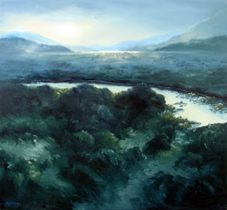
Frederick Edwin Church- Enlightenment sublime landscape painting

-‘Dämmerung in der Wildnis’ (1860)

-‘the Natural Bridge’ (1852)


6. Misrach’s work appeals strongly to me because it causes me to adopt an awareness of my own insignificance in the world, but in a very peaceful harmonious manner. I think many of the landscapes in his work look surreal and magnificent, which creates a sense of awe. One particular photograph appeals strongly to me in an emotional sense; it was taken in 2005 and is Untitled #696-05.

The image (below) is of a couple on the beach in an intimate embrace sharing a kiss. The image is clever because it keeps the viewer at a distance while letting us see the relationship between the two people. The beach is completely barren which emphasizes both the isolation of the couple and also intimacy. I think it’s a gorgeous captured scenario.


Information sourced from:

http://corehound.wordpress.com/

http://www.scribd.com/doc/6827/The-Sublime

http://artandperception.com/2007/07/wanderer-in-a-sea-of-foggy-ideas.html


images sourced from:

http://www.orbit.zkm.de/?q=node/143

http://chinachapter.blogspot.com/2006/12/early-tuesday-morning-my-sister-and-i.html

http://butlersheetmetal.com/tinbasherblog/images/steel_buildings_cloudgate.jpg

http://www.flickr.com/photos/94981824@N00/4300691

http://www.tate.org.uk/britain/exhibitions/apictureofbritain/images/home_front/turner_snowstorm.jpg

http://faculty.evansville.edu/rl29/art105/img/christo_runningfence.jpg

http://www.mocp.org/collections/permanent/uploads/Misrach1994_21.jpg

http://corehound.files.wordpress.com/2010/03/richardmisrach1.jpg

http://www.robertmann.com/artists/misrach/images/f_misrach13235.jpg

http://www.evabreuerartdealer.com.au/martin.html

http://commons.wikimedia.org/wiki/File:Frederick_Edwin_Church_001.jpg

http://freepages.genealogy.rootsweb.ancestry.com/~silversmiths/makers/silversmiths/47553.htm

http://www.aperture.org/exposures/wp-content/uploads/2008/05/couple.jpg


Monday, April 26, 2010

week 5- Tony Oursler


Tony Oursler experiments with installation works, using mainly video projection onto flat and 3 dimensional surfaces e.g. dolls, balls, architecture and living/mobile surfaces such as treetops and clouds of steam. According to the artists website he has been said to have 'freed the video image from the "box."...creating a hybrid of art and cinema'. He is regarded as one of the unique, revolutionary contemporary artists of modern times. The curatorial focus of Tony Ourslers works from the past two decades has been the human head. The works present the notion of the head as the ‘permeable center of consciousness’. His installations also address the ebb and flow of natural and mental elements e.g. light, smoke, thoughts, impulses, language, voice, memory- all of which interact with the central icon the human head. The artists installations are influenced by the artists interest in our information and media society and its effect. The elements listed previously are expressive of this interest as they use video technology as the central medium and create a strong relationship with humanity through the subject matter (the human head and in particular the eye). I imagine the artist uses public reaction from his engaging work to further his understanding of technological effect on human thought.
Ourslers’ work "Eyes" is fascinating as it evokes both a curiosity and understanding of thoughts entering and being exuded from the human eye. large blinking eyeballs are floating like independent planets in the universe; this installation ‘points to the eye as an anatomical analogue of our desire for escapism through technology’ according to the artists website. I understand this to mean that the eye has the potential to transport the mind; ironic really, as the audiences’ mind is literally transported as we view his work whilst his work simultaneously communicates this meaning. His work “Eyes” can be seen in the image below.


Number 7, Plus or Minus 2


Particular concepts of the enlightenment can be applied to Ourslers’ work. Using his multiple burning cigarettes projection form 2009 (image below) the ideologies of reason, empiricism, science, universalism and progress can all be discussed. Reason and rationality can be applied as the work is immediately striking to the viewers’ conscience; smoking is known to impact negatively on human health and whether the viewer is a smoker or non smoker the work makes one consider the actual value of smoking. Empiricism is the idea that facts about the natural world can be apprehended through sense organs. In this case we cannot smell the cigarettes but we can see the process of them burning and instinctually predict that the product will be ash, we also instinctually sense heat from the large PVC cigarettes though it is not physically being produced. The transformation of the burning cigarette into ash is literally a scientific one, but science is also apparent in the work as it brings to mind the effect of smoking on human health, an awareness that scientific research has validated and spread. Different brands of cigarettes from all over the world are displayed, creating the idea that smoking is a universal behavior; this hence makes the work universally relevant. Perhaps awareness of the negative effects of smoking on the human body will be spread by this work, hence lessening the number of worldwide smokers, this in itself would be progress.


Marlboro, Winston, Parliament, American Spirit, Salem, 2009

Dimensions variable. PVC tubes, video projection

Reference:

http://www.tonyoursler.com/individual_work_slideshow.php?navItem=work&workId=8&startDateStr=Feb.%206,%202010&subSection=Installations&allTextFlg=false&title=Number%207,%20Plus%20or%20Minus%202

Extract from: Hamilton, P. (1992). The Enlightenment and the birth of social science, in Hall, S. & Gieben B. (eds.), Formations of Modernity. Cambridge: Open University Press (pp. 21-22)

Monday, March 8, 2010


1. The themes behind the title "Last ride...' for the Auckland triennial are...


-the relationship between adventure and risk taking in contemporary art today. this includes nz contemporary art and international artists' aswell.


-the title "last ride in a hot air balloon" is speculative rather than descriptive- this comment translates that the works will not necessarily be literal but will be more open to individual perception.


-what adventure means and the risks related.


2. A curator of an exhibition...


-acts as a host of sorts. A guide that traces the basic themes and ideas in the exhibition.


3. Which countries are represented in this year's triennial?


-a deliberate selection that includes asia and the middle east.


-the "natural access" between the northern and southern hemisphere.


-strong focus on nz contemporary art and upcoming young artists whos work expresses the sense of adventure in the theme.


4. Is Auckland the only country to have a triennial? Are there other similar art shows?


-there are/have been similar exhibitions in italy (Torino Triennale), Australia (16th Biennale Sydney), Venice (52nd Biennale), South Korea (7th Gwangju Biennial). Interestingly the titles of other similar exhibitions indicate a focus on spatial art and locomotion...e.g. Slow Movement, Forms that Turn, Momentum 12.


5. Name 4 artists who will be showing work in the show.


Nick Austen- Born 1979 Whangarei. works in nz


Philippe Parreno- Born 1964 Oran, Algeria. works in france.


Jorge Macchi- Born 1963 Buenos Aires, Argentina. works in Buenos Aires.


Tino Sehgal- Born 1976 London, England. works in Berlin, Germany.


6. Select an artist's work from the website, copy the work to your blog and write a shortcomment on what the work is, and what it represents.(Reference your sources)


Mahmoud Bakhshi, Tulips Rise from the Blood of the Nation's Youth, 2008, neon, tin, wood, plastic, electric engines, courtesy of the artist and Khastoo Gallery, Los Angeles.


This work is a reflection of the political and social issues of modern day Iran, his home country. The symbol is mimicing the Iranian coat of arms, which he connects to the violence and blood shed in Iran during recent protests against the government. the fact that the symbol is refered to as a tulip almost suggests new growth and life which is interesting as the title suggests the work is a product of trauma.


7. Comment on why you find this work interesting, how does it relate to your own interests?


I think the work is interesting because it has high contrast; the fact that the space in which it is being displayed is dark shows an awareness of the context of the work. the darkness not only increases the glow of the work but it is suggestive that the work is a product of 'dark' times and most definately controversial times. this i find really interesting. The first impression of the work was that it resembled a Scottish thistle, a strong symbol of a completely unrelated country to the actual subject. I was intrigued by the title and found out it was actually the Iranian coat of arms. I was surprised that two completely different contexts could share such a similar symbol. The Iranian coat of arms is below. I find it really appealing that a work which carries violent connotations did not have to be violent and offensive in nature to communicate a message but did so through curiosity stirred by its beauty.